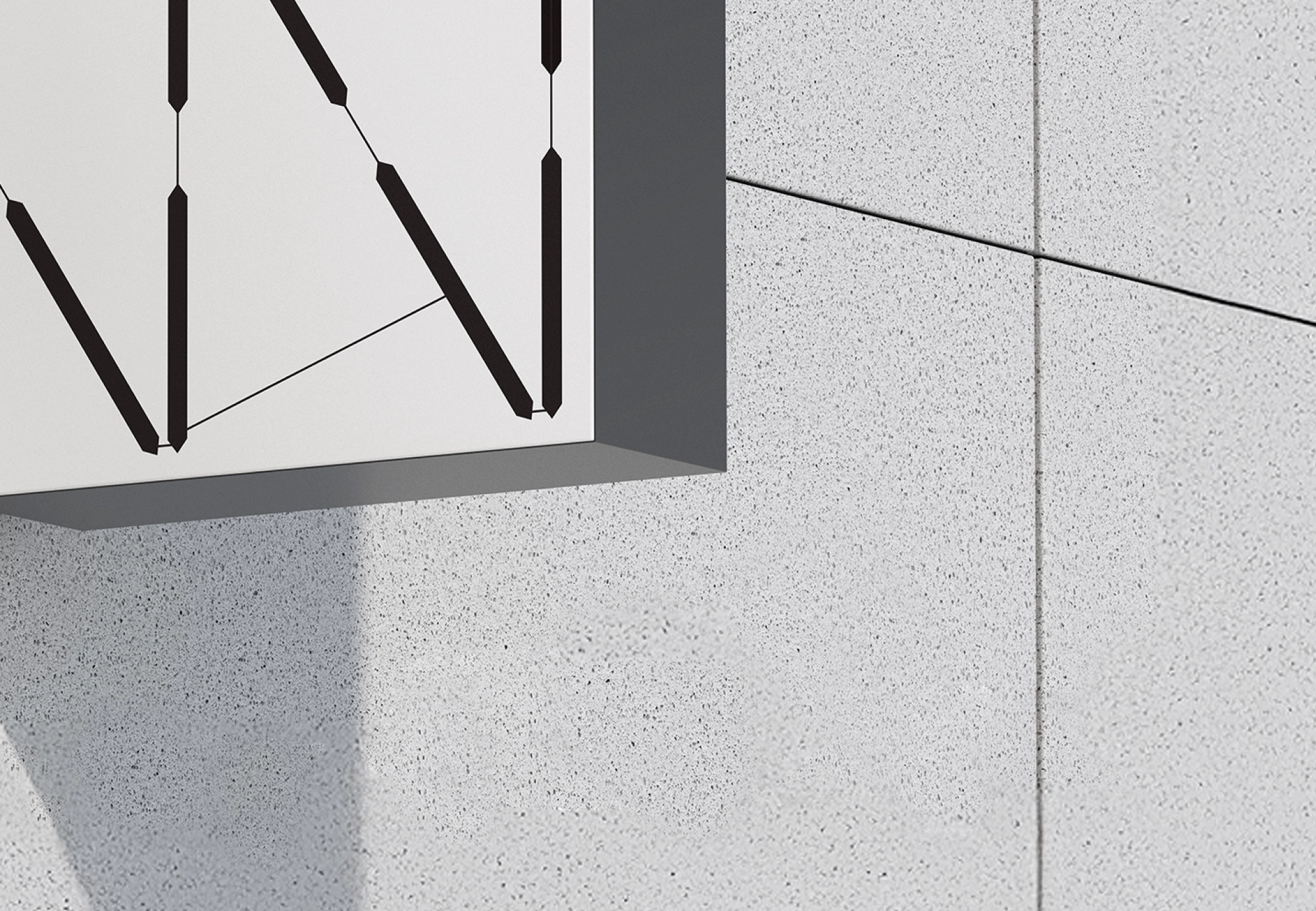
Kenter, an energy company driven by hands-on solutions, needed an identity that united its makers and reflected its vision: taking concrete steps toward sustainability.
READ MORE
Company
Kenter is a B2B company supplying large venues in the Netherlands and Germany with sustainable energy solutions and complete renewable energy systems.
Concept
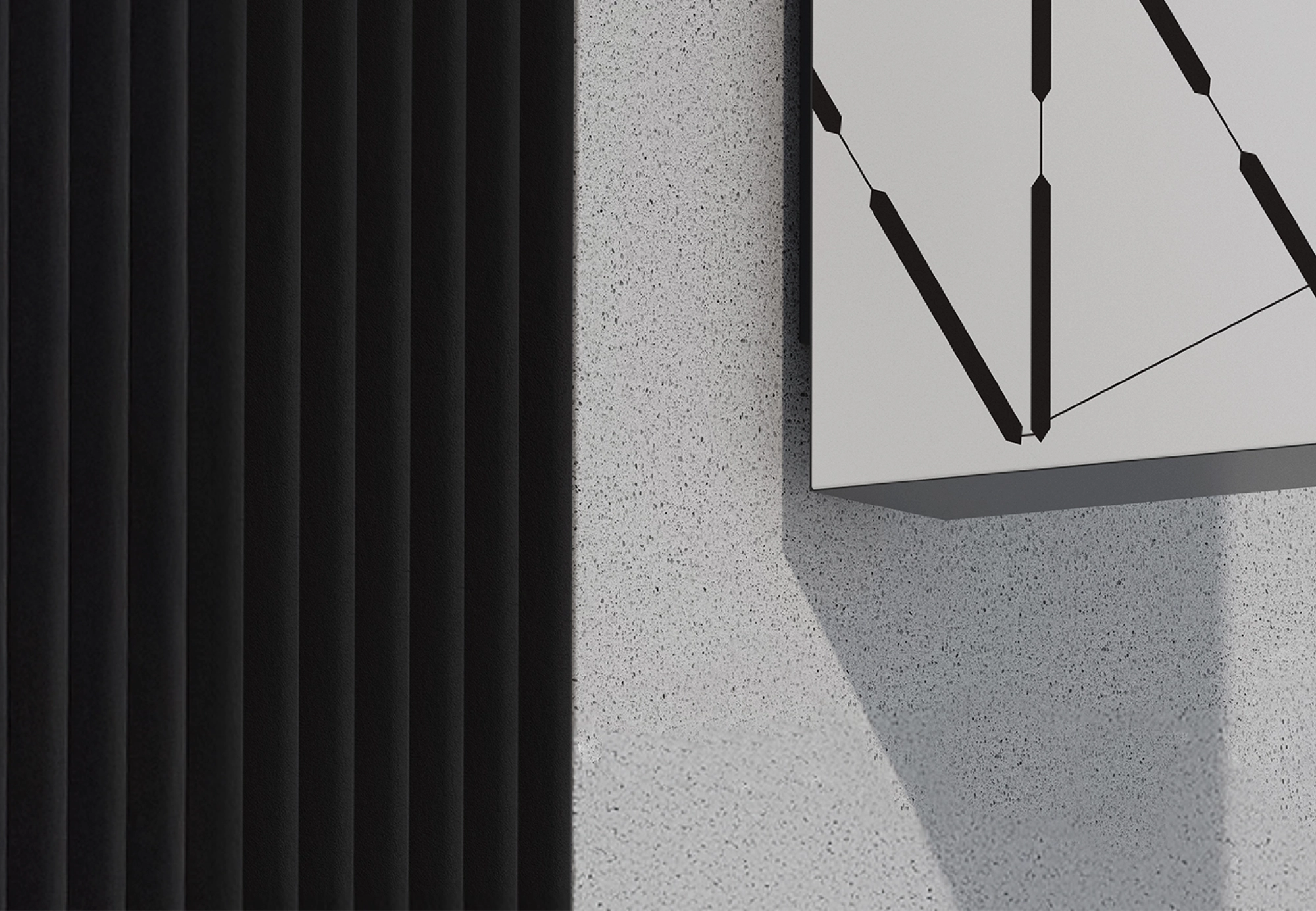
The identity is built around the necessary steps for the energy transition, using abstract forms to represent progress, power, and transformation.
Creation
A step-gradient is visualized in six key brand forms. Dark green backgrounds, the minimalist font PP Montreal, and a clean, contemporary look create a serious yet approachable identity.


